Healthier, The safest cummunity hospital
Good health begins with safe communities that have access to healthy foods, secure places for its people, this is what healthier aims for.
Good health begins with safe communities that have access to healthy foods, secure places for its people, this is what healthier aims for.
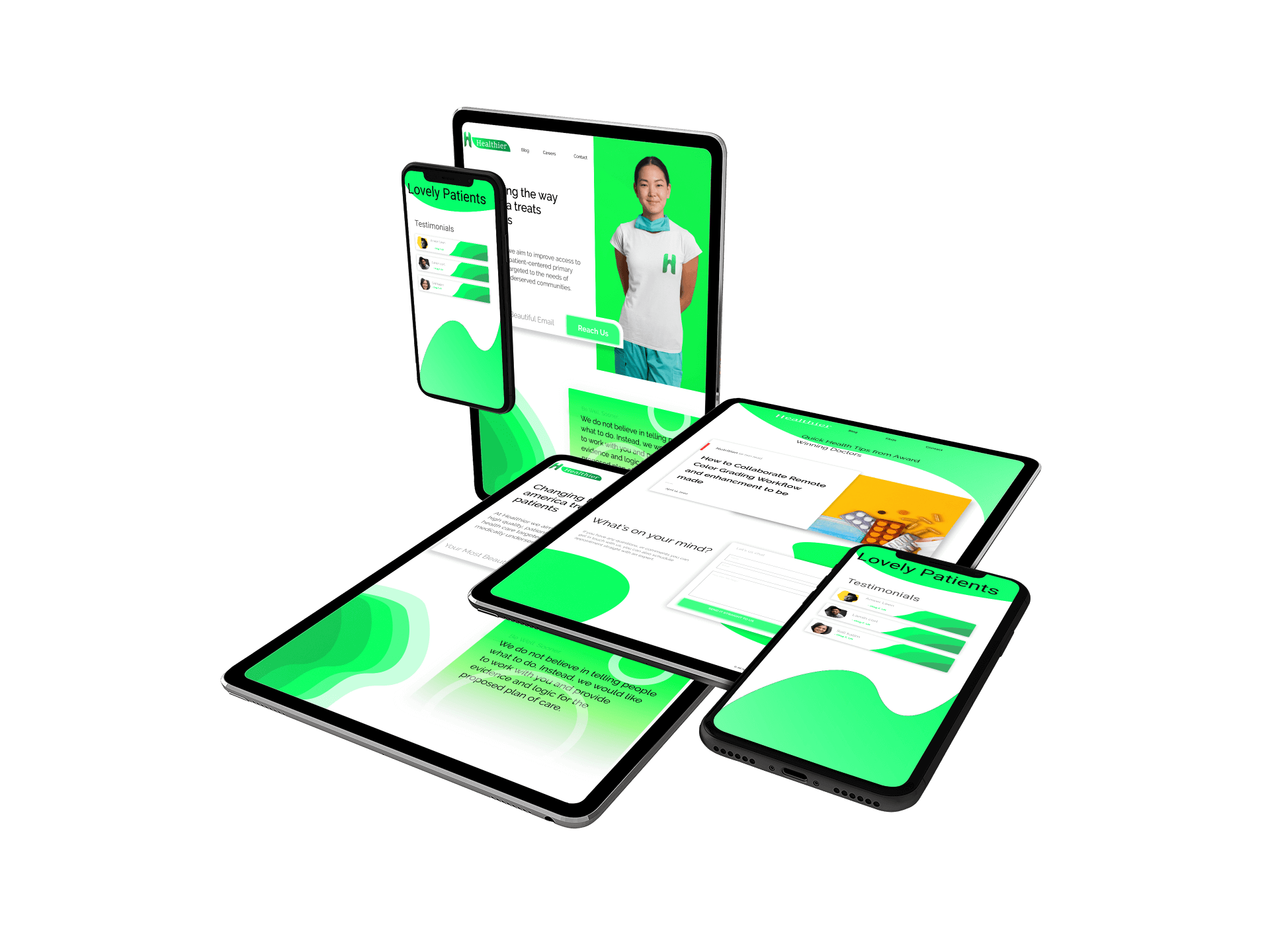
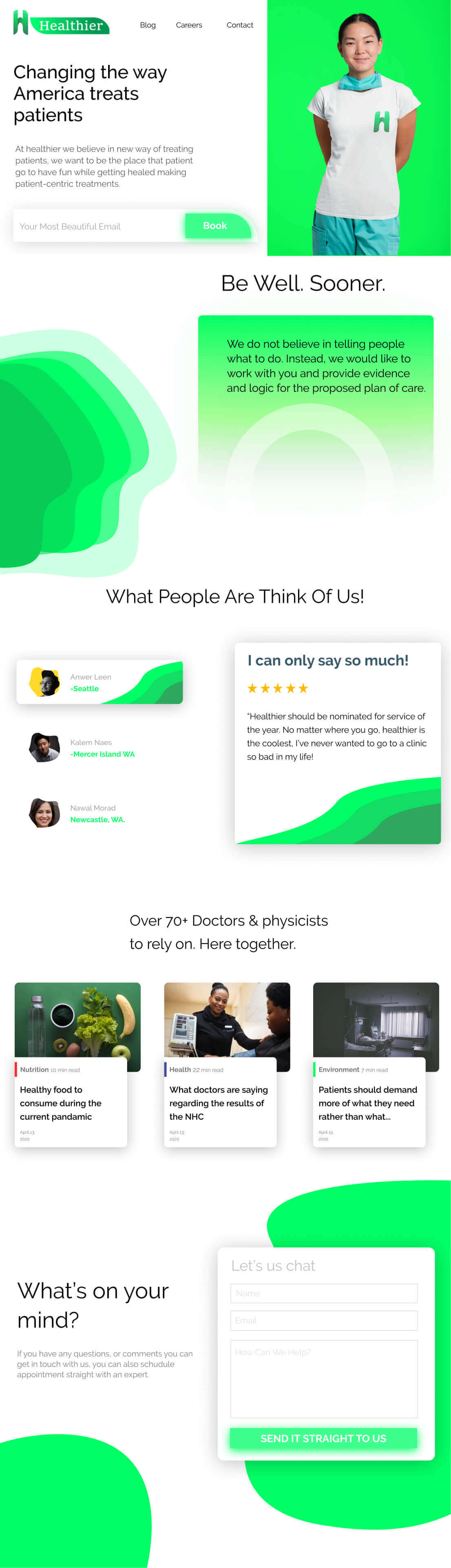
After countless resources healthier spent on its visual identity, faced the underlining problem: their visuals doesn't reflect their internal brand.
I took a different route to healthier's identity by implementing a strategic design process to create a more representative aesthetics
Ruby
#D8334A
rgb(216,51,74)
Green
#D8334A
rgb(216,51,74)
Green
#D8334A
rgb(216,51,74)
Green
#D8334A
rgb(216,51,74)