A patient is sitting in bed at 11:43 PM with one thumb on your clinic website and the other hand pressed against the part of their body they are worried about. They are not browsing. They are deciding whether you feel safe enough to call.
Your clinic website does not begin at the homepage.
It begins in a kitchen, a bathroom, a parking lot, a break room, a dark bedroom with the brightness turned low.
Someone is worried.
Maybe they found a lump. Maybe their tooth has been pulsing for three nights. Maybe their child has a rash that looks worse under cheap apartment light. Maybe they are embarrassed. Maybe they are scared of the bill. Maybe they already had one bad experience with a clinic that treated them like a folder with legs.
Then they land on your website.
And in seven seconds your website either gives them a small breath of relief, or it makes the room colder.
That is the whole game.
Not animation.
Not “modern design.”
Not a stock photo of a doctor with arms crossed like he is guarding a private airport.
Trust.
Your clinic website is either building it quietly, sentence by sentence, tap by tap, page by page.
Or it is bleeding it out before your phone ever rings.
This article is a practical way to find those leaks and close them.
It fits inside your bigger healthcare branding work, but it lives closer to the bone: the moment a worried stranger decides whether your clinic deserves their call.
Your website starts the consult before the call
A lot of clinics treat the website like a digital brochure.
Logo at the top. Smiling stock people. A paragraph about “quality care.” A service list. A button that says “Contact Us.”
This is polite.
It is also useless.
A brochure talks about the clinic.
A clinic website should begin the consult.
That means your website has a job before the front desk, before the nurse, before the doctor, before the appointment. It has to answer the frightened animal questions running under the patient’s rational questions.
Not just:
- Do you offer dermatology?
- What are your opening hours?
- Where are you located?
But:
- Will you make me feel stupid?
- Will you rush me?
- Will this cost more than I can handle?
- Have you seen people like me before?
- Is this serious?
- Can I trust your hands, your process, your tone?
Most clinic websites answer the first set and ignore the second.
That is why they leak.
Patients rarely say, “I did not book because your site failed to regulate my anxiety.”
They say nothing.
They close the tab.
They ask a cousin.
They choose the other clinic.
They keep suffering quietly.
And in the analytics, it looks like a bounce rate.
In real life, it was a trust wound.

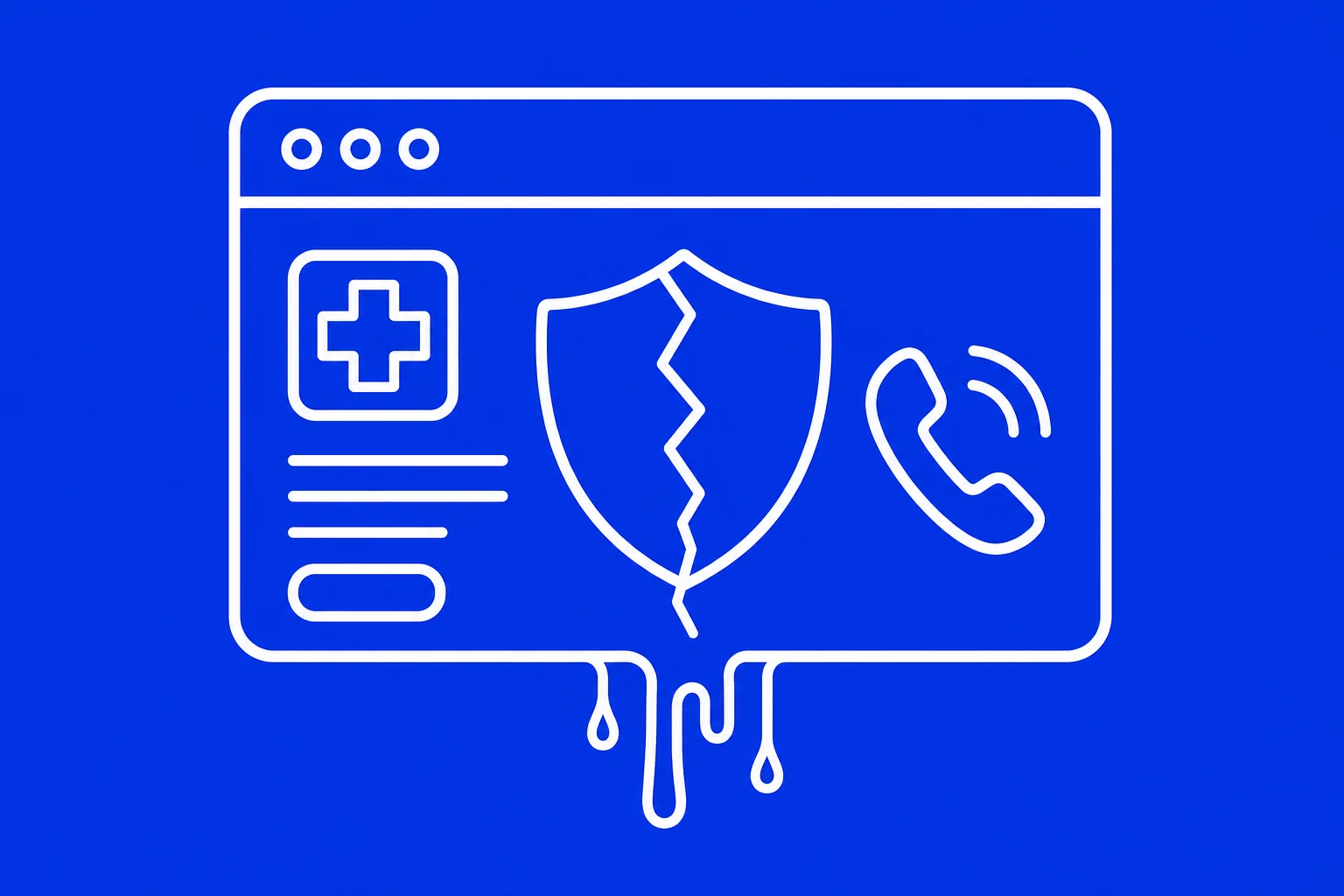
Where the bleeding starts
Trust does not usually disappear in one big dramatic failure.
It leaks through small cracks.
A vague headline.
A doctor profile with no face.
A service page that lists treatments but never explains what happens next.
A booking button that asks for too much commitment too early.
A mobile page that loads like it is dragging furniture through mud.
A testimonial hidden three scrolls below a wall of generic claims.
Each one is tiny.
Together, they tell the patient: “You are on your own here.”
And when someone is already afraid, “you are on your own” is enough to lose them.
So the audit is not only design.
It is emotional risk management.
A good clinic website reduces uncertainty before it asks for action.
A bad one demands action while increasing uncertainty.
That is the difference.
Trust leak 1: the homepage sounds like a brochure
The most common clinic homepage headline is some version of:
Compassionate care for you and your family.
Fine.
But it is also what everybody says.
A patient cannot feel the difference between your clinic and the one across town if you both sound like you were assembled from the same box of soft words.
“Quality.”
“Compassion.”
“Excellence.”
“Patient-centered.”
These words are not bad. They are exhausted.
They have been used so much they no longer carry weight.
If your homepage opens with a claim, make it specific enough to be felt.
Instead of:
Quality care for every patient.
Try:
Same-week appointments for women who are tired of being told their pain is normal.
Instead of:
Your trusted dental clinic.
Try:
Dental care for people who have avoided the chair for years. No shame. No lectures.
Instead of:
Comprehensive family medicine.
Try:
A primary care clinic that explains what is happening before handing you another prescription.
Specificity is mercy.
It tells the patient, “We see your actual situation. Not just your insurance card.”
This connects directly to healthcare brand positioning . If you do not know who you are for, your homepage will try to hug everyone and touch no one.
Fix it
Rewrite the top of your homepage around three things:
- Who is this for? Be clear about the patient, condition, fear, or moment.
- What pain are they carrying? Name the emotional and practical tension.
- What relief do you create? Say what changes after they choose you.
Your homepage should not start by admiring your clinic.
It should start by recognizing the person at the door.
Trust leak 2: the doctor feels like a ghost
Healthcare is intimate.
Someone may undress in your clinic.
Someone may cry.
Someone may describe a symptom they are ashamed of.
Someone may hand you their child.
And yet many clinic websites present the doctor like a passport record.
Name.
Credentials.
Specialty.
Maybe a dead-eyed photo cropped from a conference badge.
That is not enough.
Credentials prove permission.
They do not create warmth.
A patient wants to know:
- What kind of human will walk into the room?
- Will they listen?
- Do they explain things clearly?
- Do they work well with anxious patients?
- What do they believe good care should feel like?
Your doctor profile is not vanity.
It is a trust bridge.
Fix it
Give every clinician profile a human shape:
- A warm, real photo. Not a cold wall execution shot.
- A short paragraph in plain language about how they approach care.
- Specific patient situations they often help with.
- A sentence about what patients can expect in the room.
- Credentials, yes, but after the human context.
Example:
Dr. X works with patients who feel dismissed, rushed, or nervous about asking “small” questions. Her consultations are slow enough to explain what may be happening, what to watch for, and what the next step means.
That sentence does more trust work than a wall of abbreviations.
Patients do not only book expertise.
They book the feeling of being safe with expertise.
Trust leak 3: your services create more questions
Most clinic service pages are lists.
Dermatology.
Pediatrics.
Physiotherapy.
Dental implants.
Blood tests.
Laser treatment.
Lists are not bad. But a service list without context is a locked door with labels on it.
A patient clicks “Dental Implants” and gets a paragraph that says implants are a permanent solution for missing teeth.
They already know that.
What they need is the stuff that decides the call:
- Am I a candidate?
- Is it painful?
- How many visits does it take?
- What happens in the first appointment?
- What if I am embarrassed about my teeth?
- What can go wrong?
- How do I know if I should choose implants, bridges, or dentures?
When your service page dodges the real questions, the patient feels the dodge.
And when people feel a dodge in healthcare, they do not assume you are busy.
They assume there is a catch.
Fix it
Each important service page should answer:
- Who this is for
- Symptoms or situations that usually bring people in
- What happens during the first visit
- What the treatment path can look like
- Common fears and honest answers
- When to seek urgent care or a different option
- A soft next step
You are not trying to replace the consultation.
You are trying to make the consultation less frightening.
That is a big difference.
Trust leak 4: the call to action feels too heavy
“Book Now” can feel aggressive when someone is still trying to understand what is wrong.
This does not mean you should hide the button.
It means the button needs emotional timing.
A patient who knows exactly what they want may need “Book an Appointment.”
A patient who is scared may need “Talk to us about your symptoms.”
A parent may need “Ask if your child should be seen.”
A cosmetic patient may need “Request a private consultation.”
A dental-anxious patient may need “Start with a no-pressure visit.”
The action is similar.
The feeling is different.
And feeling is what moves the thumb.
Fix it
Use different CTAs for different levels of readiness:
- High intent: Book an appointment
- Low certainty: Ask a question
- Fear-heavy: Start with a private consultation
- Urgent: Call the clinic now
- Price anxiety: Request treatment options
Your CTA should not sound like a sales command.
It should sound like the next safe step.
Trust leak 5: your proof is buried or missing
Clinics love saying they are trusted.
Then they hide the proof like it is illegal.
A few testimonials at the bottom.
A badge in the footer.
A “since 1998” line nobody notices.
A gallery that loads slowly and shows nothing important.
Proof must appear near the fear it resolves.
If the patient worries about pain, place proof near the pain discussion.
If they worry about experience, place proof near the doctor profile.
If they worry about results, place proof near before-after context, case examples, outcomes, or process explanations where legally and ethically appropriate.
If they worry about safety, show sterilization standards, care protocols, accreditation, emergency planning, and what happens if complications arise.
Do not make proof decorative.
Make it functional.
Fix it
Build a proof map.
For every major page, ask:
- What is the patient afraid of here?
- What claim are we making?
- What evidence would make that claim easier to believe?
- Where should that evidence appear so the patient sees it before doubt wins?
Proof can be:
- Patient testimonials
- Doctor credentials
- Photos of the clinic and team
- Clear process steps
- Before-after explanations where compliant
- Safety standards
- Media mentions
- Years in practice
- Number of patients served
- Insurance/payment clarity
- Real FAQs from real consultations
Trust is not built by saying “trust us.”
Trust is built by removing the reasons not to.

Trust leak 6: the page feels dead on mobile
Most clinic websites are experienced on a phone.
Not on a big clean monitor in a design presentation.
On a phone.
With a cracked screen protector.
One hand.
Bad signal.
A child yelling in the back seat.
A patient switching between Google Maps, WhatsApp, insurance details, and your appointment page.
If your mobile site is slow, cramped, jumpy, or hard to tap, the patient does not think “technical issue.”
They feel friction.
And friction becomes mistrust.
A healthcare website must feel calm in the hand.
Fix it
Check your site on a real phone and look for these leaks:
- Buttons too small to tap comfortably
- Phone number not sticky or easy to find
- Forms asking for too much too soon
- Paragraphs too dense for a nervous reader
- Pop-ups blocking important information
- Hero images taking too long to load
- Menus hiding key services
- Address and parking details buried
- Appointment flow that breaks the mood
The mobile version is not a smaller website.
For many patients, it is the website.
Treat it like the front door.

The clinic website trust audit
Here is a simple audit you can run without a consultant, a whiteboard, or a priest.
Open your clinic website and pretend you are a first-time patient with mild panic in your chest.
Then answer these questions honestly.
1. The seven-second test
Within seven seconds, can a patient understand:
- What you do?
- Who you help?
- Why you are different?
- What to do next?
If not, your homepage is asking for patience it has not earned.
2. The fear test
On every important page, write down the top three fears a patient might have.
Then check if the page answers them directly.
If the fear is obvious and your page avoids it, the avoidance becomes the message.
3. The human test
Can a patient see the people behind the clinic?
Not just credentials.
People.
Faces. Voice. Approach. Warmth. Standards. Care philosophy.
If your clinic feels faceless online, patients will imagine the worst version of the room.
4. The process test
Does the website explain what happens next?
First appointment.
Consultation.
Treatment plan.
Payment.
Follow-up.
Aftercare.
Uncertainty is heavy. Process makes it lighter.
5. The proof test
Does every major claim have evidence near it?
Not somewhere else.
Near it.
Proof must be placed where doubt appears.
6. The thumb test
Can someone book, call, ask, or find the clinic with one thumb on a phone?
If not, you are making anxious people work too hard.
And anxious people leave.
What to fix first
Do not redesign the whole website because one article made you feel attacked.
Start where the bleeding is worst.
First, fix the homepage promise
Make the top of the homepage specific, patient-centered, and clear.
The patient should know they are in the right place before they scroll.
Second, fix your main service pages
Pick the three services that bring the most revenue or the most important patients.
Rewrite them around fears, process, proof, and next steps.
Third, fix clinician profiles
Add warmth, approach, and real expectations.
Make the doctor feel like a person before the patient meets them.
Fourth, fix the appointment path
Shorten the form.
Clarify the next step.
Make the phone number easy.
Add low-pressure options where appropriate.
Fifth, fix mobile friction
Compress images.
Increase tap targets.
Break paragraphs.
Remove pop-up nonsense.
Make the clinic feel calm in a hand.
This is not just UX.
This is patient journey mapping , but at the exact point where fear meets action.
Stop decorating the leak
A clinic website is not good because it looks expensive.
It is good because it makes a worried person feel less alone.
Design helps.
Brand helps.
Copy helps.
Speed helps.
Proof helps.
But only when they serve the same quiet purpose:
Reduce fear.
Increase clarity.
Make the next step feel safe.
The patient does not need your website to perform.
They need it to tell the truth in a steady voice.
They need to feel that someone competent is on the other side of the screen.
They need to know what happens if they call.
They need to know they will not be shamed, rushed, tricked, ignored, or left confused.
That is the work.
Your clinic website is already speaking before your team ever picks up the phone.
Make sure it is not whispering the wrong thing.