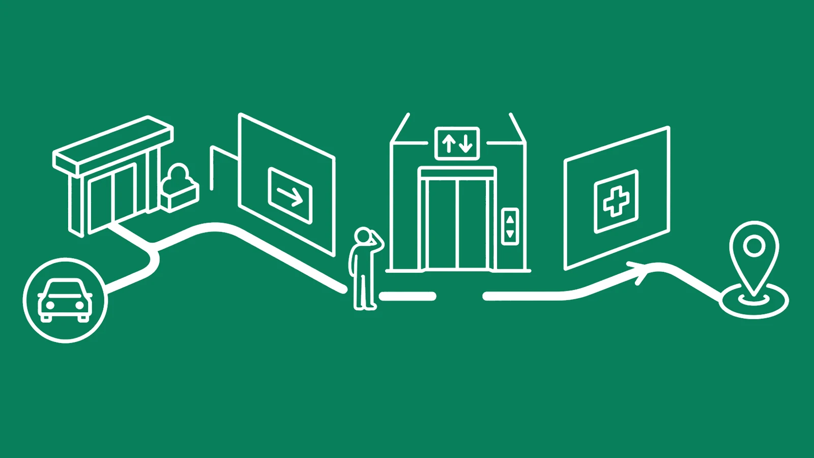


A hospital can have perfectly legible signs and still lose people every fifty feet. The letters are large. The arrows are accurate. The journey between them is broken.
A woman steps out of the parking garage with an appointment message open on her phone. It says North Pavilion. The sign above the covered walkway says Ambulatory Center. Inside, the directory calls the same place Building C.
Three names. One destination. No useful answer.
She follows a blue line until it disappears beneath an elevator bank. The elevator opens onto a floor where the walls are beige, the doors are beige, and the sign she needs sits behind the direction she is already walking. By the time she asks somebody, she has passed the correct corridor twice.
Nothing in this sequence looks catastrophic from a conference room. Each artifact can be defended. The message contains an address. The garage has signs. The lobby has a map. The elevator has a directory. The department has a nameplate.
But hospital wayfinding does not happen one artifact at a time. It happens as a chain of decisions made by a person who may be late, hurting, carrying paperwork, pushing a wheelchair, watching a child, translating for a parent, or trying not to think about what the appointment might mean.
The quiet failures live between the artifacts.
This article is about finding those gaps by walking the route as it is actually experienced—from the appointment message to the parking space, through the building, into check-in, and back out again.
The sign can be right and the journey wrong
Most wayfinding reviews begin by inspecting signs. Are they readable? Are the arrows correct? Is the type large enough? Is the contrast sufficient?
Those questions matter. They are simply too small.
A sign is one cue inside a larger system that includes the building layout, sightlines, lighting, landmarks, color, naming, appointment instructions, maps, digital directions, staff language, elevator transitions, and the ability to recover after a wrong turn. A perfectly designed sign cannot repair a destination that changes names three times. A map in the lobby cannot help someone who entered through radiology after being dropped at the wrong door. A colored floor line is not a system if it ends without explanation.
The strongest contemporary design guidance treats wayfinding as something embedded in the environment, not applied after the architecture is finished. A 2026 study based on focus groups with 34 experienced healthcare design practitioners identified six recurring strategies: simplicity, consistency, spatial hierarchy, orienting cues, ambient cues, and landmarks. Its conclusion was not “buy better signs.” It emphasized bringing wayfinding into the design process early, with cultural and contextual relevance rather than adding it as a finishing layer. Read the study.
That distinction survives even in old, complicated buildings where nobody is moving a concrete core. You may not be able to straighten a corridor, but you can stop changing the department name. You can place information before the turn instead of after it. You can make the elevator landing visually distinct. You can show the accessible route at the first divergence. You can give people a landmark that does not look like every other beige intersection.
The unit of design is not the sign.
It is the decision.
The route starts before the building
Hospitals often begin their wayfinding audit at the lobby. Patients begin much earlier.
The first directional cue may be a scheduling call, portal message, email, or text. That message quietly establishes the vocabulary for everything that follows. If it says “Women’s Imaging” while the road sign says “Diagnostic Center” and the elevator directory says “Breast Services,” the route is already fractured before the car leaves home.
Pre-arrival instructions should answer practical questions without requiring local knowledge:
- Which campus, building, and entrance should I use?
- What name will I see on exterior signs?
- Where should I park or be dropped off?
- Is the accessible entrance the same entrance?
- Does the route change after hours?
- Which floor and department name should I follow inside?
- What should I do if construction has changed the normal path?
An address alone does not answer these questions. On a medical campus, one street address can cover several buildings, garages, doors, and organizations. GPS may announce arrival while the useful entrance remains half a mile away behind a service road.
This is where digital and physical design have to stop behaving like separate departments. If your healthcare website redesign produces elegant location pages but the language does not match the building, the polish ends at the curb. If the appointment confirmation uses a vendor’s internal location label, that label follows the patient into the wrong garage.
Run the same route across every channel. Search it on the website. Open it in the portal. Read the confirmation message. Put the address into common map apps. Approach from the road. Enter the garage. Follow the pedestrian exit. Try the drop-off lane. Arrive after dark.
The route is one product, even when five teams own pieces of it.
Every decision point spends attention
A decision point is any place where a person must choose what to do next: turn or continue, enter or pass, take this elevator or another, check in here or upstairs.
Every one spends attention. Hospitals tend to spend it carelessly.
Consider an elevator bank. A person needs to find the correct elevators, determine whether all cars reach the same floors, locate the floor directory, translate a department name into a floor, press the right button, exit, regain orientation, and find the next cue. If the new cue is behind them when the doors open, the system assumes they will turn around for no reason.
Good information arrives before the choice. It remains consistent through the choice. It confirms the choice afterward.
At each decision point, ask five questions:
- Can the next cue be seen before a decision is required? A sign discovered after the turn is an explanation, not guidance.
- Does it use the same destination name as the previous cue? Synonyms feel harmless to insiders and expensive to everyone else.
- Does the environment confirm that the person is still on the correct route? Long silent corridors create doubt even when the direction was right.
- Can someone recover from the wrong choice? A useful system does not punish one missed turn with a ten-minute detour.
- Is the accessible route equally clear? A small wheelchair symbol beside an unexplained side door is not equal guidance.
A current healthcare-design treatment makes a related point: people navigate through more than words. Lighting, color, material changes, art, spatial hierarchy, and landmarks can reinforce direction and make important intersections feel different. It also warns that patients, visitors, and staff do not navigate the same environment in the same way. See the 2026 design discussion.
The practical lesson is not to paint every floor a louder color. It is to build redundancy. If one cue is missed, another should carry the route forward.
There is no average hospital navigator
Hospital buildings are often tested by people who already know them.
A facilities manager walks faster because the layout has become muscle memory. A nurse reads “4W” and sees a destination; a visitor sees a code. A designer recognizes the intended color hierarchy because they were in the meeting where it was chosen. Everyone unconsciously fills the gaps with knowledge the public does not have.
That is why a route that feels obvious to staff can still fail newcomers.
People also arrive with different bodies, senses, languages, and levels of cognitive load. Someone using a wheelchair may be sent through a service-like side route. A person with low vision may not detect a low-contrast overhead sign. A parent pushing a stroller may be unable to use the stairs that make the route look simple on a map. A patient recovering from a stroke may experience spatial or visual difficulties that make a repetitive corridor far more demanding than it appears.
A 2022 observational study followed 70 stroke inpatients across seven rehabilitation clinics for 12 consecutive hours each. Researchers observed at least one wayfinding-related event for roughly a third of the patients, while half reported having become lost in their clinic at least once. Backtracking and asking staff for help were common, and many events occurred between patient rooms and therapy rooms. The study is specific to stroke rehabilitation, not a universal estimate for every hospital visitor. Its value is more concrete: layout, repeated-looking corridors, decision nodes, and elevator areas shaped what people could do independently. Read the openaccess study.
A 2024 Applied Ergonomics paper approached the issue through diverse cognitive and physical needs, using an exploratory multi-criteria method rather than claiming one universal design answer. That is the right direction of travel. Accessibility is not a separate route you inspect after the “normal” route passes. It changes what a usable route means. See the paper.
Do not perform disability theater during an audit. Closing your eyes for two minutes does not reproduce living with low vision. Sitting in a borrowed wheelchair does not make you an authority on wheelchair access. Use accessibility expertise, invite people with relevant lived experience, and compensate them for that knowledge.
The goal is not empathy as performance. It is evidence that changes the environment.
Rescue events are evidence
Every hospital has human patches.
The security officer who says “second left, past the coffee shop” before anybody finishes the question. The receptionist who leaves the desk to escort another family to imaging. The volunteer who knows the printed map is wrong because construction closed the east corridor three weeks ago. The nurse who finds a patient near the wrong elevator and walks them back.
These are generous acts. They are also data.
When people repeatedly ask for the cafeteria, restroom, elevator, exit, or lobby, the question is not an interruption floating outside the system. It is the system producing work.
A 2025 descriptive survey collected responses from 301 hospital staff in the United States about wayfinding. Respondents estimated spending about 30 minutes per week helping other people find their way, and reported that directional assistance could distract from primary duties and produce frustration. Nearly 44 percent said they had experienced incivility from users frustrated by wayfinding problems. These are staff perceptions from a cross-sectional survey, not a direct time-and-motion measurement, so the numbers should not be turned into a universal labor-cost calculator. They still reveal where the burden lands when navigation fails: on whoever is standing nearest the confusion. Read the study.
Do not remove the humans. Hospitals need people who can help, especially when a route changes or a visitor needs more than a sign can provide.
Remove the need for the same rescue fifty times a day.
Start logging rescue events at the location where help was requested. Record the intended destination, the last cue the person remembers, and the action staff had to take. Keep the record operational and de-identified. You do not need a patient name, diagnosis, or appointment detail to learn that six people reached the west elevators while trying to find outpatient imaging.
A question repeated at one desk is a broken cue upstream.
Walk the route without cheating
A useful route audit does not happen around a floor plan with coffee and highlighters. It happens on foot.
Choose one meaningful route rather than “the whole hospital.” Start with a high-volume destination, a department that generates directional questions, or a path disrupted by recent construction. Define the actual starting point: a parking level, transit stop, drop-off lane, or connecting building.
Then walk it under rules that make insider knowledge less useful.
1. Begin with the appointment instruction
Use the same message a patient receives. Follow its vocabulary exactly. If the message says “Cardiac Diagnostics,” do not silently translate that into the “Heart Center” signs you know to follow.
2. Record every decision point
Note where a choice is required, what cue is available before the choice, and whether the next cue confirms the route. Include road turns, garage exits, doors, lobby forks, elevators, corridor intersections, department thresholds, and check-in.
3. Mark observable friction
Do not write “confusing.” Record what happened: the destination name changed; the arrow was hidden by an open door; the sign appeared after the intersection; the route required backtracking; the accessible path diverged without warning; the next cue was not visible; staff intervention was required.
4. Test recovery
Take the plausible wrong turn. Can someone return to the route without starting over? Are there confirmation cues in both directions? Does the map show “you are here” in an orientation that matches the viewer, or does it demand a mental rotation while people move behind them?
5. Include the threshold
Finding the department is not the same as finding the correct check-in point. Large units may have several desks, queues, kiosks, or waiting rooms. The final twenty feet can be where confidence collapses.
6. Walk back out
Reverse the route without using memory. Find the exit, garage, pickup area, pharmacy, or next department. Check what happens after hours when a familiar door is locked.
7. Repeat the walk
One successful walk proves almost nothing. Test different entrances, times, lighting conditions, and route needs. Ask a person unfamiliar with the building to narrate what they expect at each choice. Do not coach them through the gap you are supposed to observe.
This is narrower than a full patient journey mapping exercise. That broader work studies the experience across discovery, access, care, and follow-up. A route walk-test studies physical and informational continuity in enough detail to fix it.
Fix the chain, not the loudest sign
The most visible failure is not always the first failure.
A crowd asking for directions in the lobby may tempt the hospital to install a larger directory. But the real break may be the parking confirmation that sends imaging patients to the wrong entrance. A department may request another overhead sign when its public name conflicts with the scheduler. A facilities team may repaint a floor line when the line fails because it disappears at every elevator.
Prioritize fixes by the behavior they need to change.
1. Conflicting destination names
Choose one patient-facing name and propagate it through scheduling, the website, map listings, road signs, parking instructions, directories, elevators, departmental signs, and staff scripts. Preserve internal codes where operations need them, but do not make visitors translate the org chart.
2. Information that arrives too late
Move the cue before the decision point. Add advance notice when a turn, floor change, or route divergence is coming. Confirm the route immediately afterward.
3. Silent stretches
Add reassurance without covering the corridor in noise. A repeated color, recognizable landmark, destination-and-distance cue, or environmental change can tell people they are still moving correctly.
4. Indistinguishable intersections
Give important nodes an identity. Elevator lobbies and corridor junctions should not all look like copies of the same waiting room. Use landmarks and environmental cues that are visible from the approach, not decorative objects discovered after arrival.
5. Accessible routes treated as exceptions
Identify the accessible route before it separates. Keep the language, landmarks, and confirmation cues as complete as the primary route. Test doors, slopes, elevator access, reach ranges, and the dignity of the path with qualified expertise.
6. Repeated staff rescues
Trace the question backward. Where was the last point at which the person still felt certain? What changed immediately after it? Repair that handoff, then watch whether the rescue event declines.
7. Temporary changes that became permanent confusion
Construction hoardings, moved clinics, locked entrances, and relocated desks can invalidate an otherwise sound system overnight. Give temporary routes an owner, an effective date, and a removal date. Update digital instructions before the barrier appears.
The action plan should name the decision point, observed behavior, likely cause, owner, proposed change, and acceptance test. “Improve signage” is not an action. “From the north garage pedestrian exit, a first-time visitor can identify the correct elevator bank before entering the lobby intersection” is testable.
That is the difference between decoration and repair.
The way back counts
Most directions end at arrival because the organization’s transaction has begun. The person still has to leave.
The return trip may happen after bad news, sedation, a long appointment, an unfamiliar procedure, or several hours in a room without windows. The entrance that felt obvious in daylight may be locked after evening discharge. The person who arrived with a companion may leave alone. The pickup driver may be waiting at a different door from the one the patient can find.
Exit routes deserve the same sequence of cues as arrival routes. So do routes to the pharmacy, laboratory, billing desk, cafeteria, restroom, and connecting appointment. “Follow the signs to the lobby” is not enough when three lobbies exist.
Navigation failures also bleed into other operational problems. Our patient wait time guide explains how a wrong garage or building can become a late arrival. An unusable location message can also become one of the hidden barriers behind a missed appointment. That is why efforts to reduce patient noshows should examine the route rather than assuming every absence began with forgetfulness.
The building does not experience these as separate metrics. The person experiences one visit.
A route should not require courage
Hospital wayfinding often fails quietly because people compensate. They arrive early. They circle the campus. They ask a stranger. They follow someone wearing scrubs. They pretend to understand a hurried direction, then ask again at the next desk. Staff absorb the questions. Families absorb the embarrassment. Schedules absorb the delay.
The building appears to work because humans keep rescuing it.
Walk the full route. Use the names the public receives. Stop before every decision. Look for the next cue without borrowing what you already know. Record where the chain changes language, arrives late, disappears, or sends some people through a lesser path. Then fix the first broken handoff instead of buying the loudest sign.
A hospital cannot remove every uncertain moment from a visit. It can stop adding unnecessary ones.
If your hospital’s physical and digital experience tells two different stories, talk to Unnus. We help healthcare organizations find the broken handoffs and design a clearer journey from first instruction to final exit.