


The problem is not that your patient intake form has forty-seven fields. The problem is that nobody can explain why half of them are there, who uses the answers, or why every patient has to answer them now.
Nobody designed the whole form.
Billing added three questions after a difficult claim. A clinician added seven because one new patient arrived without enough history. Marketing wanted to know where referrals came from. The form vendor copied the old clipboard into a browser. A manager marked everything required because incomplete submissions created work at the desk.
Each decision made sense to somebody, once.
Years later, a patient is standing in a kitchen with one thumb on a phone, trying to remember an old medication dose while the form asks for an employer, a fax number, the same insurance member ID they entered during booking, and a referral source before it explains what will happen at the first visit.
The practice calls this intake.
The patient experiences an administrative excavation.
This article is not another universal patient intake form template filled with every field a practice might theoretically want. It is a method for deciding what your practice should ask, when it should ask, who owns the answer, and what to remove when nobody can defend the work.
You can also download the field architecture workbook near the end. It is built for a real review with operations, front desk, billing, clinical, privacy, accessibility, and implementation owners. No patient-level information belongs in it.
Nobody designed the whole form
Bloated intake forms rarely begin with a cruel person trying to exhaust patients. They grow by accumulation.
A question gets added because one case went badly. A field survives a software migration because deleting it feels riskier than carrying it forward. Two systems do not exchange data, so the patient becomes the integration. One department collects information “just in case” another department needs it. Required fields multiply because the form cannot distinguish a common path from an exception.
This is why shortening a form is politically harder than lengthening it. Adding one question has a visible beneficiary. Removing it creates a room full of imagined disasters.
So teams reach for cosmetic relief. They break the form into steps. Add a progress bar. Make the cards rounder. Hide sections behind accordions. Replace a paper packet with a clean mobile interface.
The questions remain.
A twelve-screen form can carry the same burden as a six-page clipboard. Progressive disclosure can reduce visual noise, but it cannot give a field a purpose it never had. Before changing the interface, inspect the information architecture underneath it.
For every question, the team should be able to name:
- the decision or action the answer supports;
- the person or role who owns that decision;
- the earliest stage when the answer becomes necessary;
- the system that should hold the source of truth;
- the consequence when the patient cannot answer;
- the recovery path for an exception.
If those answers live in six different heads, the form has no owner. It has contributors.
Every field must end in an action
A useful field completes a loop. The practice asks a clear question. The answer reaches a named owner. That owner does something different because the answer exists.
An orphan field completes no loop. The patient types. The system stores. Nobody acts. Staff ask again later because they do not trust, see, or know about the first answer.
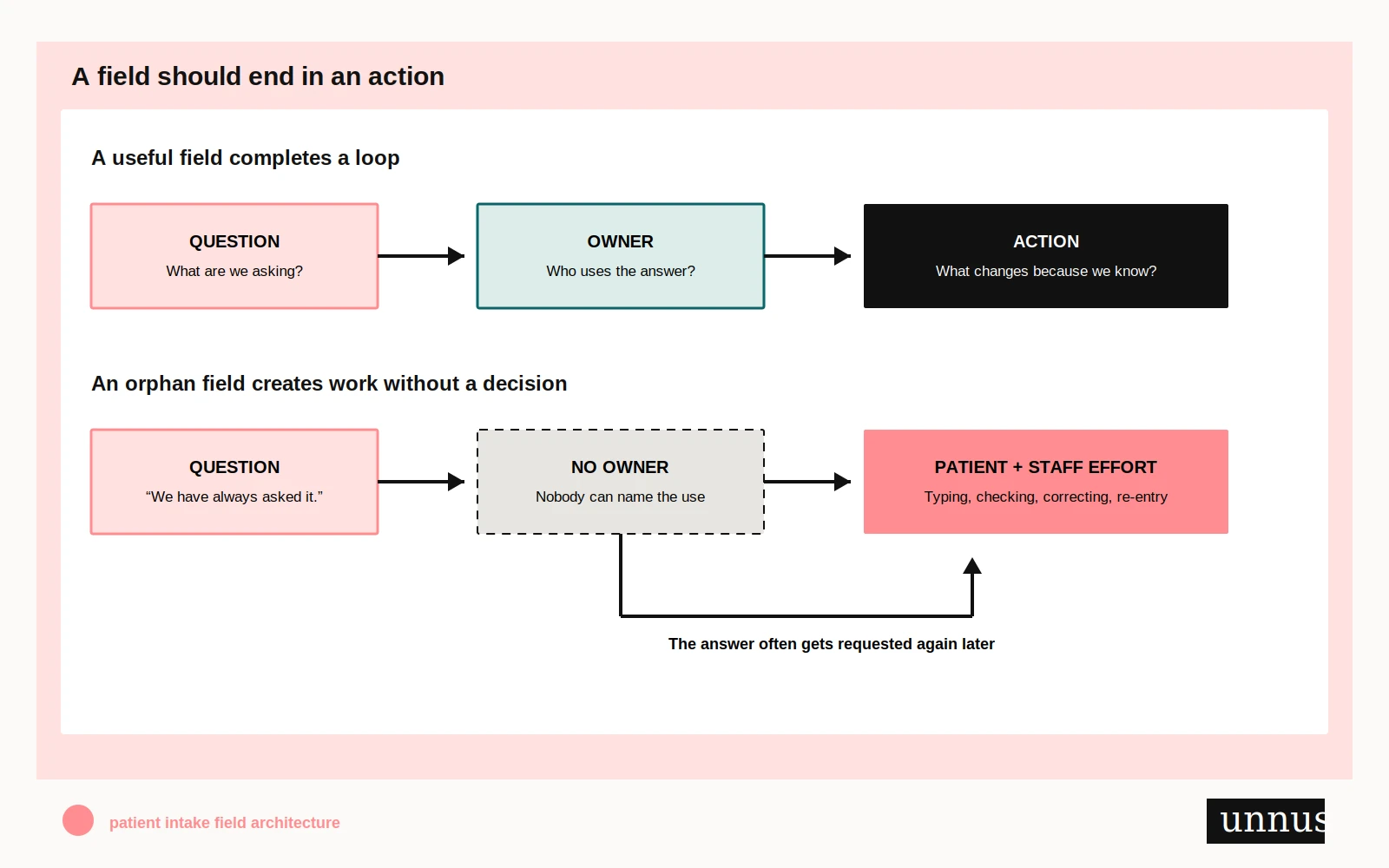
Take a familiar field such as employer name. Do not argue about whether medical forms commonly include it. Ask what happens next.
Does billing need it for a documented purpose? Does a specific service require it? Is the answer routed to the person who uses it? Is it needed before the visit? What happens when someone is unemployed, self-employed, retired, unable to work, or unwilling to answer? If nobody in the room can identify the use, “it has always been there” is not a reason. It is an archaeological note.
The same test applies to fields that feel more obviously healthcare-related. A complete medical history may be important, but that does not prove it belongs inside an appointment request. Insurance details may be needed, but that does not justify asking for them during booking, again during pre-registration, and again at the desk. An emergency contact may be appropriate, but the form should explain why the practice asks for another person’s information and whether the field is required.
Do not confuse this operational review with a universal legal rule. The HIPAA Privacy Rule’s minimum-necessary standard applies to specified uses, disclosures, and requests for protected health information, and it also includes exceptions—including disclosures to or requests by a provider for treatment. The regulation does not hand a practice a universal list of intake fields to delete. Read the current rule and its exceptions.
That is why the review needs qualified clinical, billing, privacy, security, legal, and operational owners where those questions arise. Design can expose an unanswered governance question. It cannot invent the answer.
Five decisions for every field
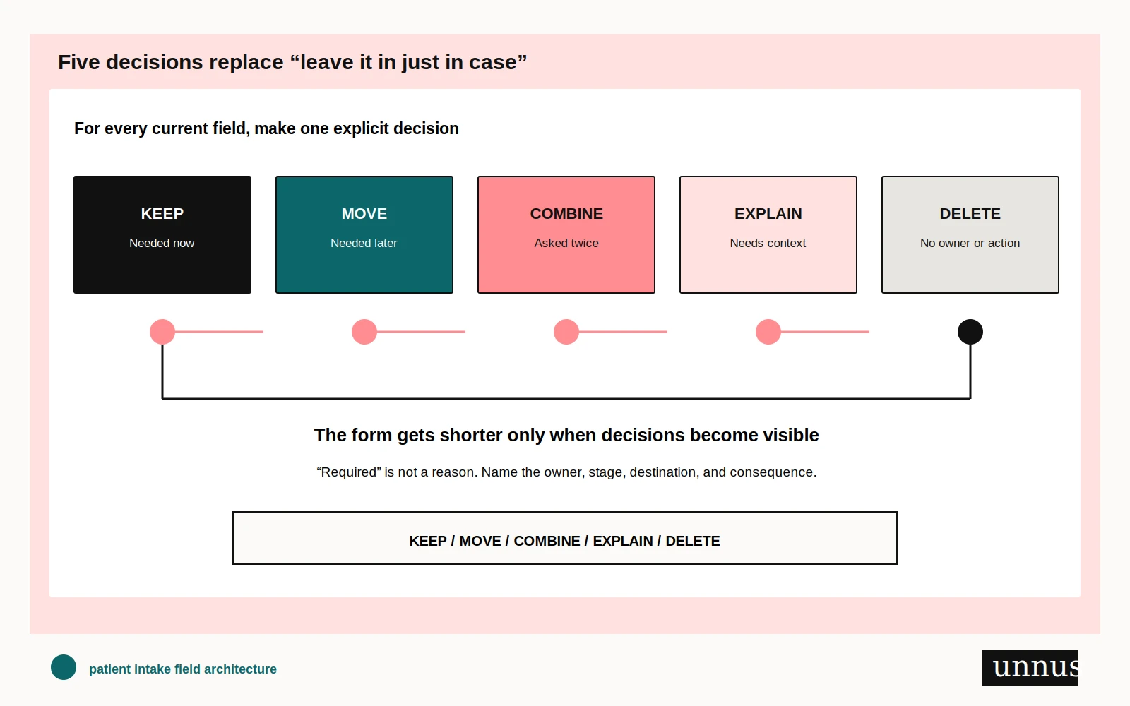
Do not review a form with a vague instruction to “simplify it.” That produces taste arguments. Give every current field one explicit disposition.
Keep
Keep a field when the answer is necessary at this stage, has a known owner, reaches a defined destination, and changes an action. Keeping it does not mean keeping the current label, requirement, or interface.
Move
Move a field when the answer matters, but not yet. Clinical history may belong in a clinical workflow. A marketing attribution question may belong after essential registration tasks. Arrival verification belongs close enough to the visit to catch changes.
Moving a field is not hiding it on screen four. It is changing when the practice asks.
Combine
Combine fields when the same information is requested in different words or systems. Choose a source of truth, decide how changes are verified, and stop asking patients to repair integration gaps by repeating themselves.
Explain
Explain a field when the answer is necessary but the purpose, format, sensitivity, or consequence is not obvious. A short sentence beside the field can answer: Why are you asking? Who will use this? Is it optional? What should I do if I do not know?
W3C’s WCAG guidance requires labels or instructions when content expects user input, and it warns that too much instruction can be as harmful as too little. The aim is enough information to complete the task without undue confusion—not a wall of policy text above every box. See the WCAG 2.2 explanation.
Delete
Delete a field when nobody owns the answer, no action follows, the information comes from a better source, or the cost of asking cannot be defended. Put unresolved regulatory, payer, clinical, or policy questions into a decision log rather than settling them through confidence and volume.
A team may discover that it cannot safely delete a field yet. Good. “Needs qualified review” is a real decision state. “Leave everything forever” is not.
Intake is a sequence, not a document
One long form often hides several different jobs:
- Booking: Can the correct visit be created?
- Pre-visit registration: What does the practice need to prepare?
- Clinical history: What does the care team need for the encounter?
- Consent: What must be presented, reviewed, and handled under applicable requirements?
- Arrival: What needs to be verified because it may have changed?
- Staff verification: Which exceptions or conflicts require human resolution?
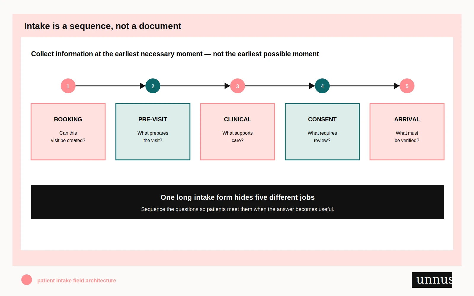
The rule is simple: collect information at the earliest necessary moment, not the earliest possible moment.
That distinction protects both sides of the desk. A patient trying to request an appointment should not have to complete an entire clinical history before knowing whether the request can be accepted. A clinician should not lose necessary information because a redesign team decided that “shorter” was the only goal. A front-desk employee should not have to hunt through a giant submission to find the three items needed before arrival.
This also clarifies the boundary with patient selfscheduling. Scheduling helps someone choose or request the right visit. Intake prepares that visit and the work around it. If the two are collapsed carelessly, the first interaction starts asking for trust and effort before the practice has even confirmed the path.
Current federal Health Literacy Online guidance makes a related design point: some people may rely on a mobile device as their only way to access digital health information. It recommends developing content for the smallest screen, limiting clutter, minimizing typing, and making controls easy to tap. Read the mobile guidance.
A responsive layout cannot rescue an undisciplined collection strategy. On a small screen, unnecessary questions become more visible because each one consumes the entire width of the moment.
Tear down the form before you rebuild it
Print the current form or export every field into a working inventory. Do not begin inside the form builder. Software encourages implementation decisions before the team has made information decisions.
Then walk the fields one by one.
“Full legal name”
Question: Which identity workflow requires this format, and how are preferred or chosen names handled in patient-facing interactions?
What to inspect: The label, the destination, matching requirements, staff display, correction path, and what the patient sees later. Do not casually redesign identity fields without involving qualified owners.
“Emergency contact”
Question: What is this person being designated for, under what circumstances might the practice contact them, and must every patient provide one?
What to inspect: Purpose text, relationship options, phone format, optionality, and the path for someone who cannot or does not want to name a contact.
“How did you hear about us?”
Question: Does this marketing answer deserve to interrupt the care-preparation path?
What to inspect: Whether it can be optional, moved later, inferred from appropriate analytics, or collected through a shorter controlled list. Marketing curiosity should not masquerade as admission criteria.
Insurance information
Question: Has the patient already provided it, and which system is trusted when details conflict?
What to inspect: Duplicate entry, card uploads, mobile usability, staff verification, change handling, and language that avoids promising coverage or final cost.
Medical history
Question: Who clinically owns the content and when do they need it?
What to inspect: Scope, specialty relevance, unknown or approximate answers, save-and-return behavior, medication entry burden, and whether the form’s structure matches the care team’s review workflow. A generic internet template should not dictate clinical content.
Required fields
Question: Required for what—submission, scheduling, care preparation, billing, policy, or software convenience?
What to inspect: The actual consequence of an empty answer. If the only consequence is that the software prefers a value, the implementation should be challenged. If the field is legitimately required, the form needs a usable exception path for “unknown,” “not applicable,” “I need help,” or another locally appropriate response.
The goal is not to win a contest for the fewest boxes. The goal is to make every box defensible.
The rebuilt form asks less and explains more
A better form does not merely delete. It changes sequence, language, ownership, and recovery.
Group fields around the patient’s task rather than the database schema. Put visible labels above fields where that improves the relationship on mobile. Keep labels present after typing instead of using placeholder text as a disappearing substitute. W3C guidance notes that explicit labels help assistive technology connect the label to the control and that visible labels are preferred or needed by many users. See the formlabel tutorial.
Use plain, specific language:
- Replace Primary insured information with the ordinary wording your billing team and patients both understand.
- Replace unexplained abbreviations with complete terms.
- Put format guidance beside the field before an error happens.
- Mark optional fields honestly instead of marking almost everything required.
- Explain sensitive requests at the point of asking, not in a distant policy.
- Offer an exception route when no dropdown option tells the truth.
A clear field is not automatically an accessible form. Keyboard order, programmatic labels, error identification, focus behavior, contrast, target size, screen-reader output, time limits, language, and save-and-return behavior still need testing. Automated checks can catch some failures. They cannot tell you whether the question belongs there in the first place.
Health Literacy Online’s 2025 third edition centers people-first design, accessibility across devices, actionable content, and content governance. Its point is larger than readability: people need digital health information and tools they can understand and use. Explore the current guidance.
That is the standard for intake. Not “the form submitted.” The right information reached the right person at the right moment, and a patient who did not fit the happy path could still move forward.
Test the work behind the submit button
The prettiest failure happens after submission.
A confirmation screen says Thank you. Behind it, a PDF lands in a shared mailbox. Someone prints it. Someone else retypes four fields into the EHR. An insurance image is too blurry to read. The clinical team cannot see the history. The patient arrives and receives another clipboard because staff do not trust the online record.
A form is only the visible mouth of a larger system.
Trace one de-identified test submission through the operation:
- Where does the answer land?
- Who receives a notification?
- What can each role see?
- Which information gets copied manually?
- Which fields map cleanly into the intended system?
- What happens when an upload fails?
- How does a patient correct an answer?
- What happens after a duplicate submission?
- How are incomplete items assigned and resolved?
- Does the confirmation explain what happens next?
Use dummy data designed for testing. Do not put real patient information into screenshots, spreadsheets, design files, tickets, or vendor demos.
If an intake form sits on a public website or passes information through analytics, email, integrations, automation, or third-party tools, the data path needs a separate qualified privacy and security review. Our HIPAAcompliant website guide explains why a protected form cannot be evaluated in isolation from what receives, copies, or transmits its responses.
The team should also test the form with people who did not build it. Watch where they pause, reread, guess, abandon, or ask what a field means. Do not coach them through the ambiguity you are supposed to observe. Include mobile use, keyboard use, zoom, assistive technology, language needs, and realistic exception paths in the test plan.
Download the field architecture workbook
The workbook turns this method into a working implementation brief. It does not score the practice or manufacture a compliance verdict. It makes decisions, owners, dependencies, and unresolved questions visible.
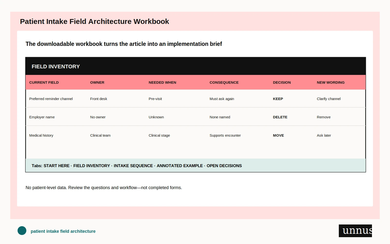
Download the editable workbook: Patient Intake Field Architecture Workbook (.xlsx)
It includes:
- a field inventory with owner, purpose, stage, destination, and consequence columns;
- controlled decisions for keep, move, combine, explain, delete, or needs review;
- an intake-sequence map from booking through staff verification;
- annotated examples showing how the method works;
- an open-decisions log for clinical, billing, privacy, legal, accessibility, technical, and operational review;
- a sixty-minute working-session structure.
Do not enter patient names, answers, contact details, identifiers, diagnoses, images, insurance data, or any other patient-level information. Review field definitions and workflow only. The workbook is an operational design aid, not clinical, legal, billing, privacy, accessibility, or compliance advice.
Run the review in one working session
Bring the current form, the workbook, and the people who own the work after submission. A designer alone cannot answer clinical necessity. A clinician alone may not see duplicate front-desk entry. Billing may know why a field exists but not why it appears too early. Privacy and security may see a data path nobody drew. Accessibility cannot be bolted on after the vendor configuration is finished.
Use sixty focused minutes:
Minutes 0–10: name the workflow
Agree on the form’s actual boundary. Does it begin at appointment request, after scheduling, or inside a portal? Which visit types use it? Where do answers go?
Minutes 10–30: assign every field
For each field, name the purpose, owner, earliest necessary stage, source of truth, destination, and consequence if unanswered. Mark unresolved questions instead of debating them from memory.
Minutes 30–45: choose the disposition
Keep, move, combine, explain, delete, or assign qualified review. Pay special attention to repeated information, fields required only by software habit, and questions collected earlier than their use.
Minutes 45–55: test exceptions
What happens when somebody does not know, cannot answer, has no matching option, uses assistive technology, needs another language, loses connection, uploads an unreadable file, or cannot complete the form alone?
Minutes 55–60: assign the next move
Name the implementation owner, reviewer, acceptance test, and date. “Make the form shorter” is not an action. “Move insurance-card capture from appointment request to pre-registration, preserve a staff-assisted route, and verify the image reaches the billing queue” is testable.
This is narrower than full patient journey mapping. The article studies one information handoff deeply enough to change it. If the same friction appears across booking, directions, preparation, check-in, billing, and follow-up, the practice may need the broader journey view.
A shorter form is not the finish line
A short form can still be careless. It can omit information the care team needs, hide required context, exclude people who do not fit its options, fail on a phone, or send clean answers into a broken back office.
Length is evidence, not a verdict.
The real measure is whether every field earns the effort it asks from the patient and the work it creates for staff. The question should arrive when its answer becomes useful. The label should make sense before an error. The person who owns the answer should receive it. The exception should have somewhere dignified to go.
Start with the current form. Put every field on trial. Keep what carries weight. Move what arrives too early. Combine what the system asks twice. Explain what deserves context. Delete what nobody can defend.
Then test the handoff after the button.
If your intake problem crosses the website, scheduler, form vendor, EHR, staff workflow, and patient communication, changing the template alone will not repair it. Talk to Unnus. We help healthcare organizations strip unnecessary effort from the visible form and the invisible system behind it.