If you’re bored with the same “lookalike” dental sites, we are too. Let’s check some of the most creative dental websites.
We’ve curated one of the best dental websites for 2021. These works put the usual dull healthcare websites to shame. You can Navigate using the content table on your right to jump between the designs.
Let’s start with our first site.
1) Aesthetics Dental
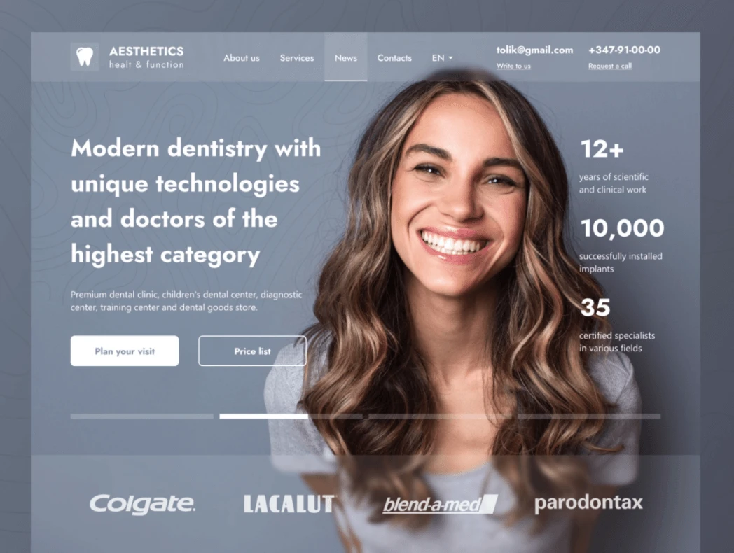
Our first design comes from Spring Art Studio . What I like about this concept is the intersection between the main image and the website elements that gives it this “overlapping” effect. And while the contrast between the white text and the background needs a little bit more work, it makes for an intriguing dental website.
2) Aesthetics Dental Laboratory
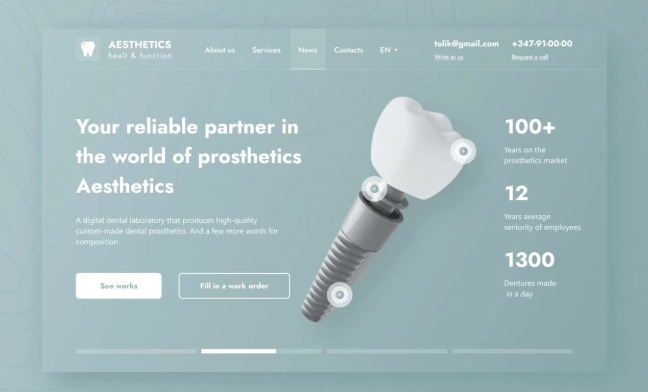
Again, our friends at Spring art studio made a second concept for an aesthetics dental lab. What makes this one unique lies in its use of the modern design of 3D Model. This interactive model makes browsing the website more enjoyable to the user.
3) D-Care landing page
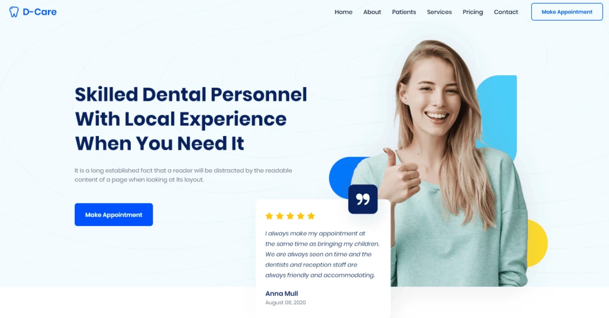
Our next design is done by the Australian based agency Studio Express. The well-thought out website structure from its headline, Call To Action button and patient reviews makes it perfect for the user to use. In addition, the minimalist approach and the use of white spaces made the website radiate a modern feel.
4) San Francisco Dental
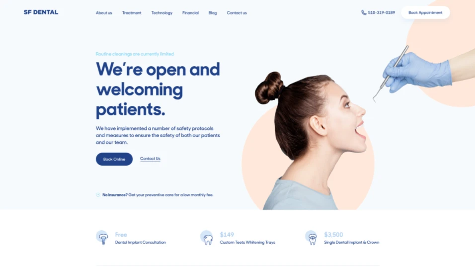
The next design is from the talented UX/UI designer Songeez . What this website gets right is the creative use of imagery. While using white coats and office spaces images can inform the user of the business, San Francisco Dental focuses its imagery more on the patient.
5) Dental Care DSO
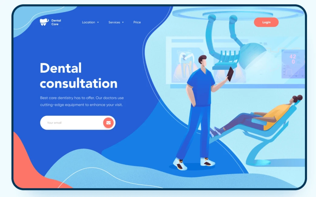
The Huston texas based creative Tino Agency has decided to switch it off a little bit by using costume illustration to their dental website concept. The well placed email form and the minimalist aspect of the home page makes it easy for the visitors to take action and sign up immediately upon their landing.
6) 24 Dentist
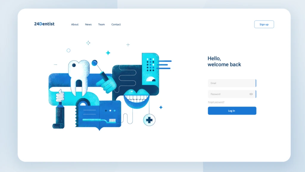
Merix Studio is known for their simplicity when it comes to web design. And this dazzling dashboard is their way of showing why simple design works. Instead of bombarding the user with unending pop ups and texts, Merix decided to declutter the website and give enough room for all the elements to breathe. This makes the website a breeze to use and highly effective.
7) Smile Wow Dental
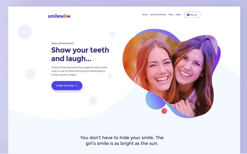
Our next website comes from the professional UI designer Naresh and his concept of Smile Wow dental website. What stands out in this layout is the perfect use of visual hierarchy and the well placed call to action buttons. This kind of conversion-focused design makes smile wow’s website perfect for attracting more patients online.
8) Dentora Dental Care
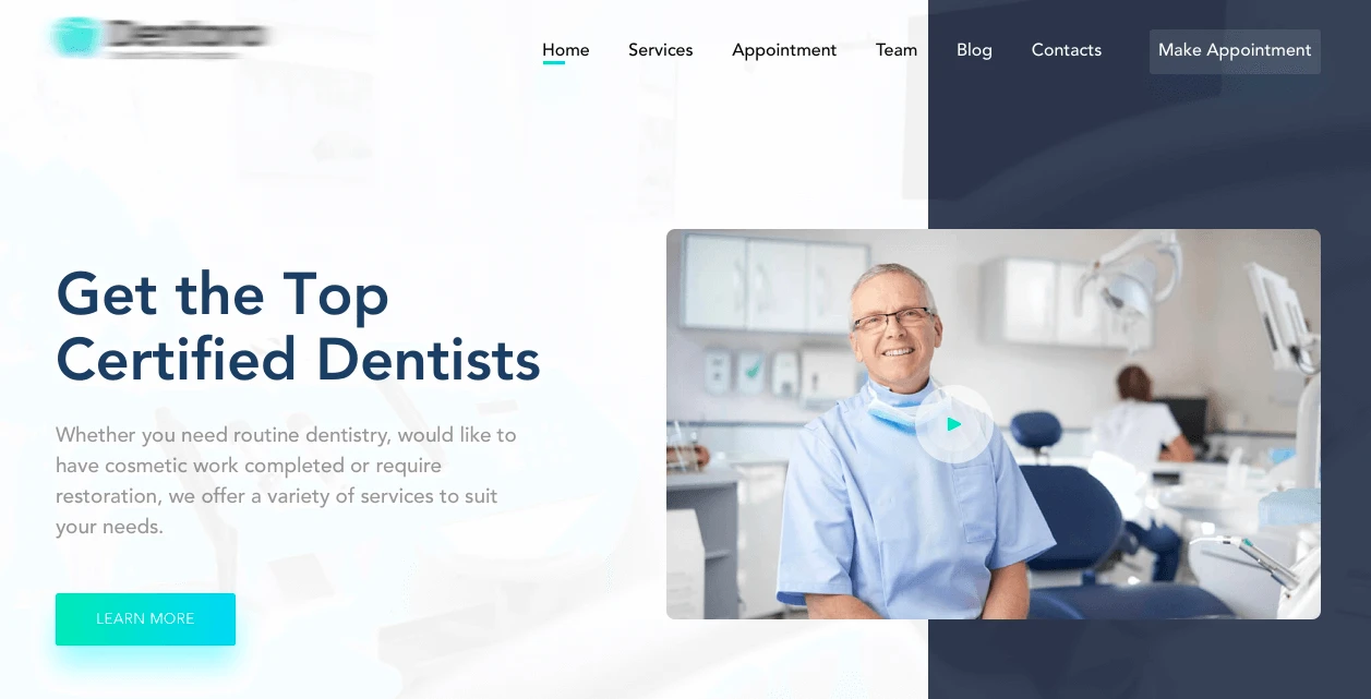
The next website is designed by the Bangladesh based web designer Dibbendo Pranto and his concept of Dentora Dental. Dibbendo nailed the design in a variety of ways, from the hovering video section, the divided header and the modern feel of the website.
9) Channel Dental Platform
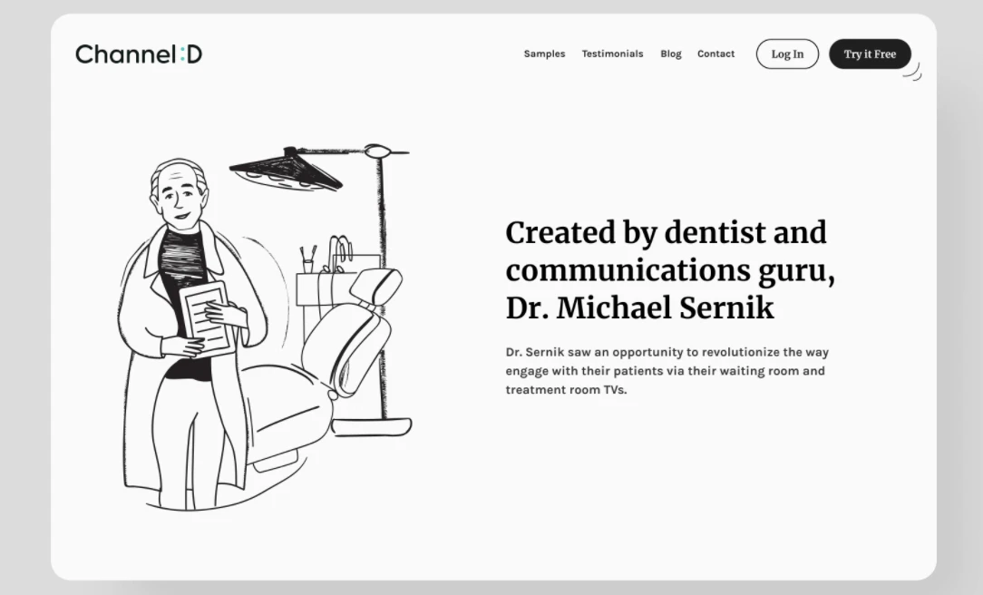
What happens when a creative powerhouse collaborates with the smartest dentist in Washington? Well, the Channel :D platform. The dental engagement platform has differentiated itself from the “lookalike” by adopting a unique black & white style to their website. Along with the bespoke illustration, Shakuro agency has made a masterpiece.
10) Profimed Dental Store
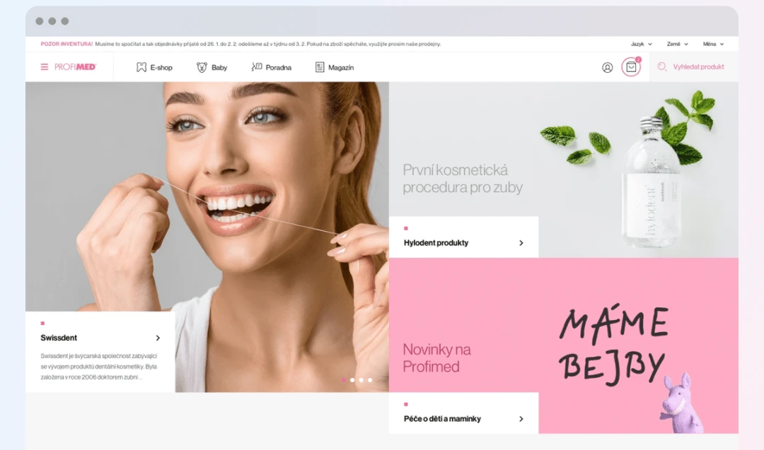
The SMDK Design agency Turned Profimed dental store into a premium brand by adapting a minimalist design to reflect modern feel and look for the company. And while the website is beautifully made, what makes this one different is its accessibility and how easy it is to use for dental product shoppers.
11) Machniak Orthodontics Clinic

The Polish Dental Clinic Machniak redesigned their website to match the current aesthetic standards of the competitive landscape. What differentiates the website is the flawless aggregation of content and the seamless scrolling experience. This trendy piece of work was designed by Daniel Jędrzejczyk .
12) VC Dentistry Clinic
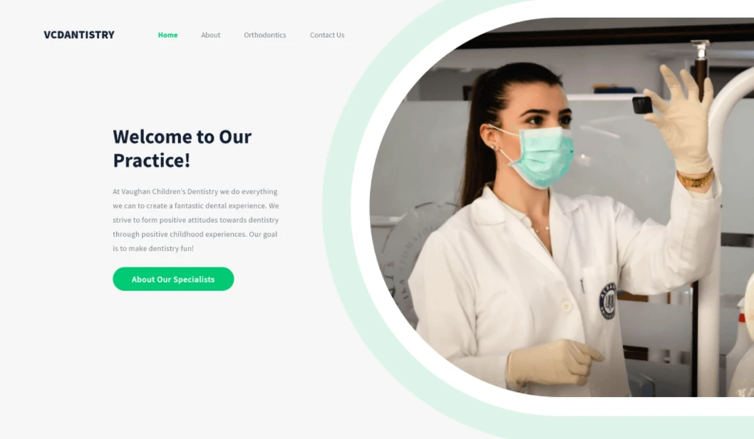
Our next website is designed by the indian based UX designer Abir Mahmood . What I like the most about this piece of art is its unconventional layout. Instead of the boring “bricks-boxes-like” layout, Abir managed to craft an appealing and interesting arrangement of content.
13) 20/32 Dental Studio
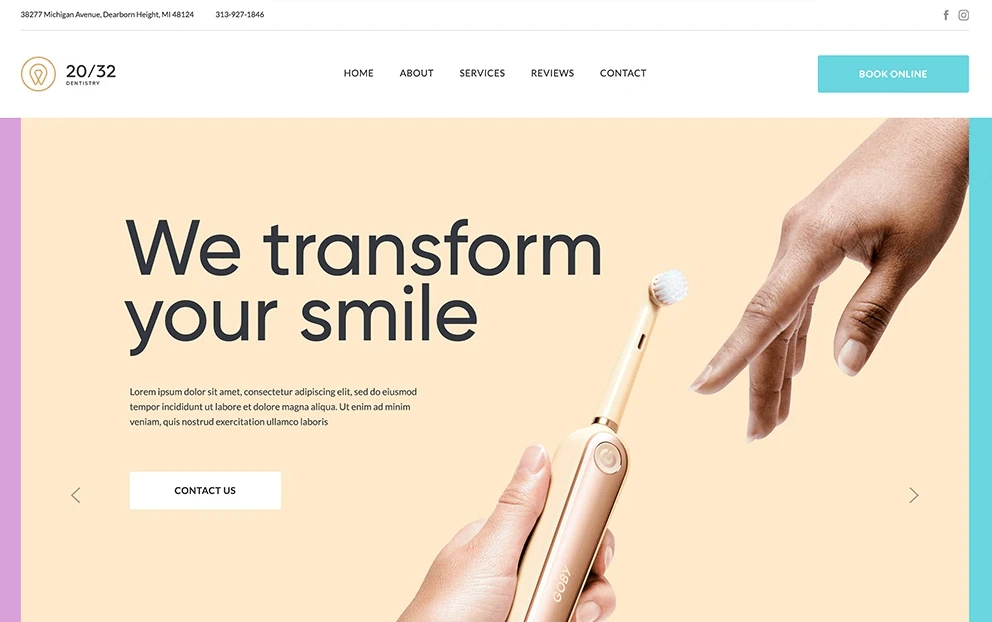
The detroit-based dental clinic 20/32 knows that a great digital experience is critical for increased patient satisfaction. And with this in mind, they launched their new website with a patient-first approach. The sleek web design and the ease of use made it one of the best dental websites on the market.
14) Divine Care
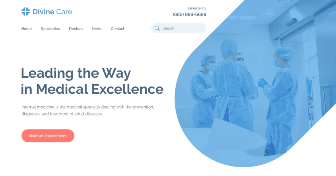
Designed by the skilled UX designer Siman , Divine Care is a new concept that makes creative use of vector images for captivating web visuals. With its great use of white spaces, visual hierarchy, and harmonious color contrast, this one had to be on this list.
15) Dental Academy
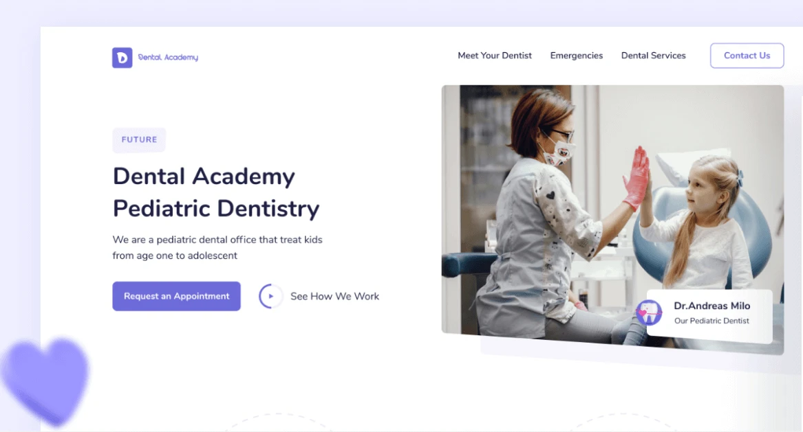
The Callour Team is known for their unorthodox web design concepts, and this is no different. The Dental Academy website makes the best use of animation along with creative element placement. With the clear CTA buttons and explanation video on the left, the user engagement will soar through the roofs.
16) Dent Equip Store
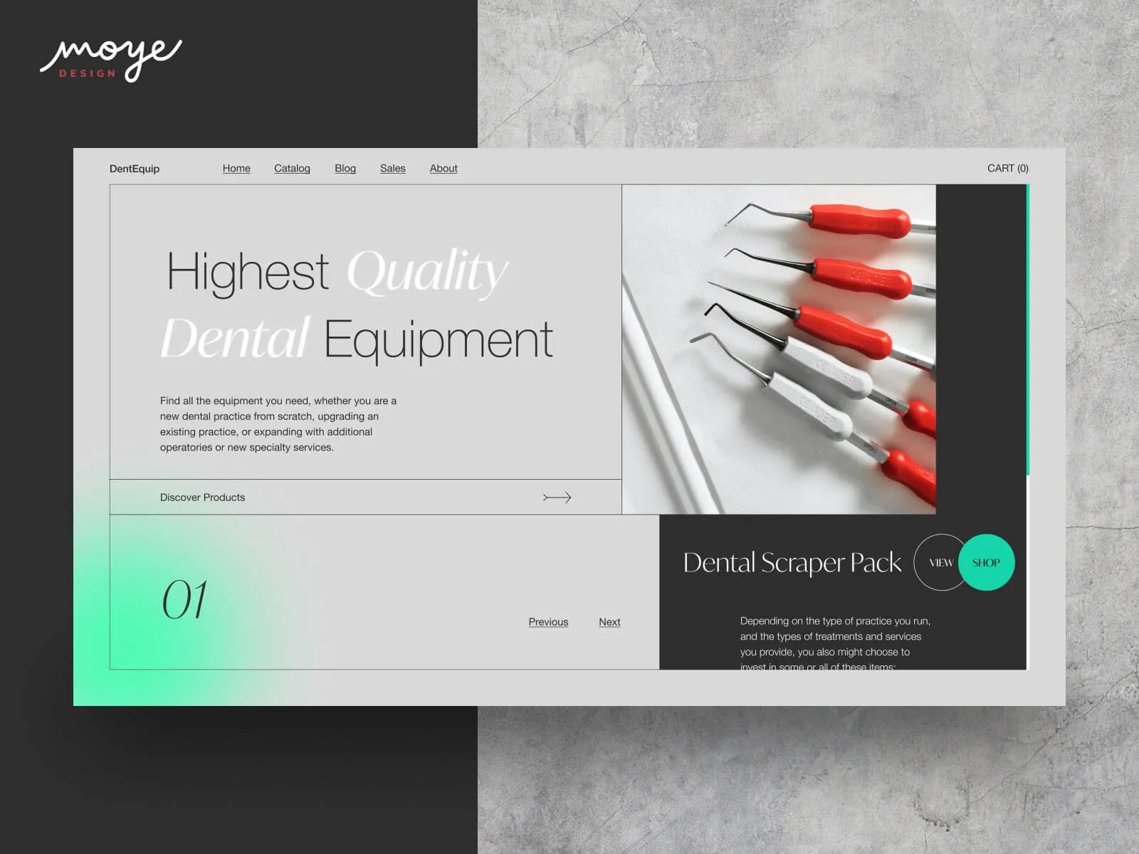
The Serbia based design agency, Mayo Design made one of the sleekest dental equipment websites. This one is for an e-commerce platform selling equipment for dental practices. The design is clean with playful but discrete accents, whether in typography or colors.
17) One Smile Dental
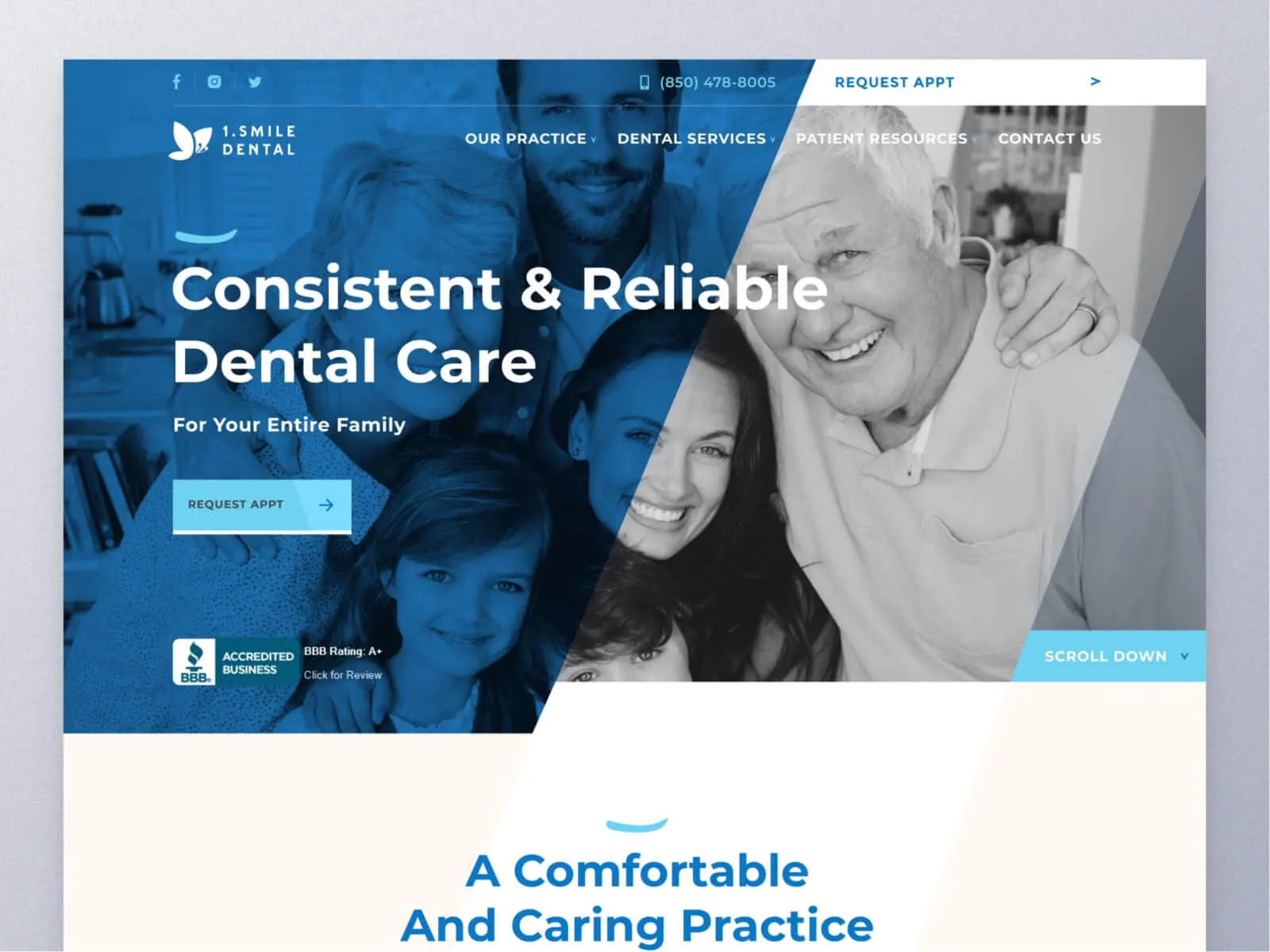
Our next design comes from the Digital agency Claw . What differentiates 1 Smile Dental website is the use of smooth header animation. This little known web effect makes for a great way to increase patient engagement online.
18) Refresh DDS
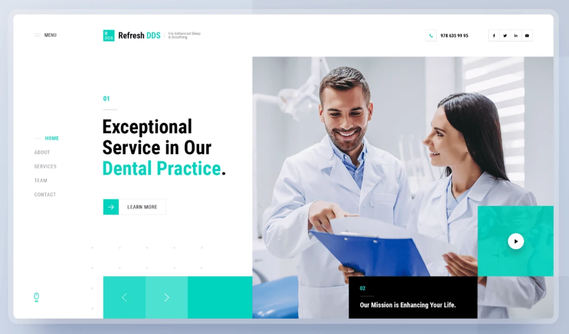
Seahawk studio is killing it with their new dental design of Refresh DDS. With their focus on being future-oriented practice, their new website reflects this futuristic aspect of the practice. With the clear call to action buttons, creative layout and artificial-like feel, this one’s definitely one of the best designs out there.
19) Dr. Sam Boston Website
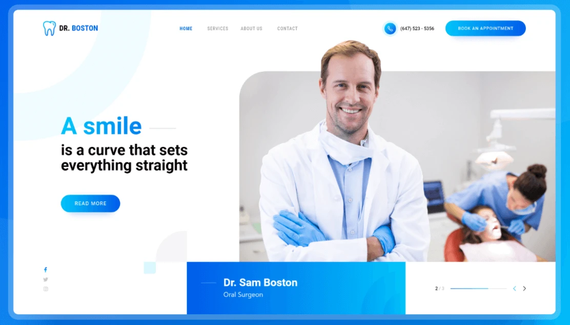
This is the second Seahawk studio’s design with their work for dental surgeon Sam Boston. What I like the most about this one is the brilliant use of color gradients. This made the website’s objects stand out and added a little bit of “depth” to the homepage.
20) Dental Plus
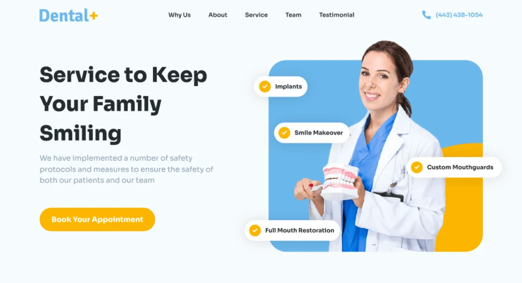
The next website is designed by Spiral Studio . While this one is no different in terms of design than the one we’ve shown before, it stands out in terms of animation. Spiral studio made the work come to life by adding the smooth fade in/out transitions along with the soft scroll effect.
21) Untu Dental
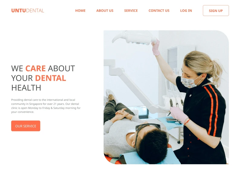 The next one is done by the same agency Spiral Studio
. This one is less focused on the animation but more on the actual aesthetics. The well-thought out content layout, the clear “book appointment” buttons, and the wisely-placed testimonials, make the website perfect for converting visitors into recurring patients.
22) Dr. Rocco’s Dental Center
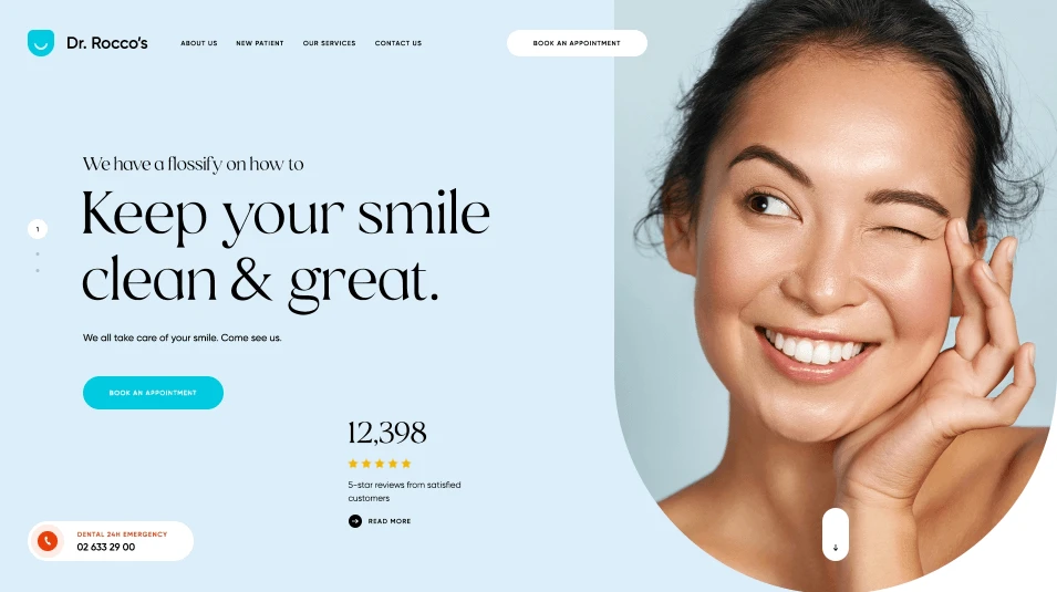
The last one we have in today’s list is by the creative studio Vision Trust . This one is a combination of rest works: from the creative layout, clean look, bold typography, and the glossy animations, Dr. Recco’s dental center website is truly the best one so far.
Looking for a new website design for your practice?
Your website is a critical asset that you can use to grow your dental practice. And if you’re looking to redesign/launch your website to increase patient volume, streamline your booking process, and scale your business, please feel free to say hello . We’d love to help you craft a premium and result-driven website.
